Colors should be used purposefully to communicate how things should be used in the interface. Colors should be consistent so products may be easily interactable and predicatable. These colors are for Hack4Impact, but you may change the base colors to fit your products styling and branding.
Base Colors
Base colors are the primary branding colors. For bridge, it's Hack4Impact's blue, indigo and grey. The middle shade in each palette is the primary color.
lighter#B4D8FA
light#3E87CD
Blue#155DA1
dark#0E4E8A
darker#0D3F6E
text#031425
lighter#7D9CD2
light#415F94
Indigo#2D4979
dark#253E68
darker#13294E
text#061734
lighter#EBEEF2
light#8B9199
Grey#666B72
dark#46494F
darker#272A2D
text#061734
Secondary Colors
Secondary colors are for actions or states. Green is for success. Red is for error. Yellow is for warning. The middle shade in each palette is the primary color.
lighter#BDF3C6
light#90E19E
Green#4C9859
dark#256830
darker#154C1E
text#031D07
lighter#FFBCBF
light#D1595F
Red#A62B31
dark#8A1A1F
darker#6B1014
text#35080A
lighter#FFECBD
light#FFD15F
Yellow#FDBE21
dark#DA9C03
darker#A77700
text#201803
Typography
Color Pairs
Top color indicates a color that can be used for main text. Bottom color is used for supporting text.
Charcoal#272A2D
Iron#4B4E52
Ink#0A162A
Slate#363949
white#FFFFFF
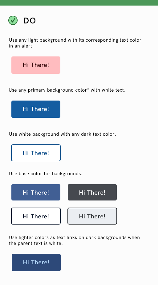
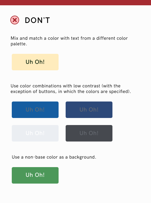
Usage