A button is used to trigger an action.
- Primary Buttons are strong visual indicators to guide the user to complete their goal or journey. Example situations are where the user would want to go to the next step, starting a journey, etc. These should be obvious.
- Secondary Buttons are used for to provide an alternative action to the primary one. These should be clear but not obvious.
- Tertiary Buttons are used for actions that may be used by the user but not necessarily the action they would need to do right then.
For the primary set of colors (blue), you should use a different shade based on the background its on top of (note the differences in hover as well).
Primary Color
Primary
Secondary
Tertiary
Background: #155DA1
Hover Background: #0E4E8A
Text: #FFFFFF
Background: #FFFFFF
Border/Text: #155DA1
Hover Border/Text: #0E4E8A
Text: #155DA1
Hover Text: #0E4E8A
Background: #155DA1
Hover Background: #0D3F6E
Text: #FFFFFF
Background: #FFFFFF
Border/Text: #155DA1
Hover Border/Text: #0D3F6E
Text: #155DA1
Hover Text: #0D3F6E
Background: #FFFFFF
Text: #2D4979
Drop Shadow on Hover
Background: #2D4979
Border/Text: #FFFFFF
Drop Shadow on Hover
Text: #FFFFFF
Disabled State
Primary
Secondary
Tertiary
Background: #B4D8FA
Text: #FFFFFF
Background: #FFFFFF
Border/Text: #B4D8FA
n/a
Background: #EBEEF2
Border: #8B9199
Background: #FFFFFF
Border: #EBEEF2
Text: #8B9199
n/a
Background: #415F94
Text: #7D9CD2
Background: #2D4979
Border: #415F94
Text Color: #7D9CD2
n/a
For all other colors
This includes secondary colors (red, green, yellow) and indigo. You should use the "dark" shade of the color for the hover state and the "light" shade of the color for disabled state. Look at Colors from more specifics.
State
Primary
Secondary
Active
Use the primary color in the palette.
Use the primary color in the palette for both border and text.
Hovered
Use the “dark” color in the palette.
Use the “dark” color in the palette for both border and text..
Disabled
Use the “lighter” color in the palette.
Use the “lighter” color in the palette for both border and text.
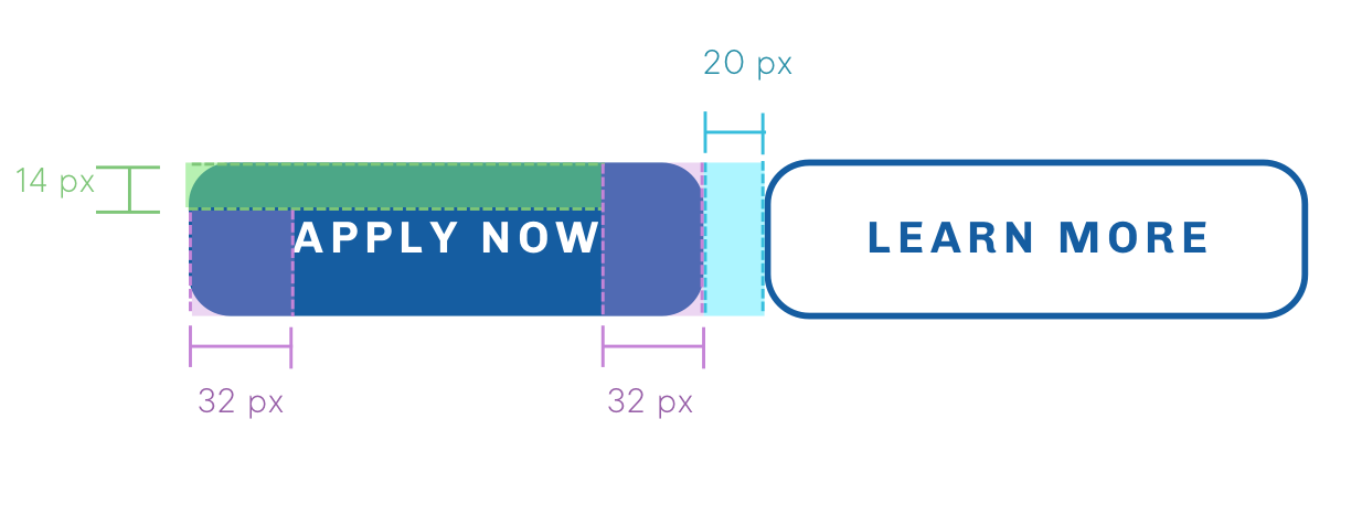
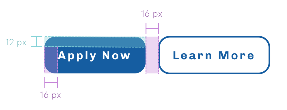
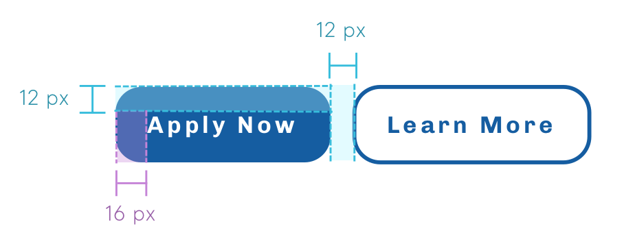
Button Structure and Spacing
There are 3 sizes of buttons. Large buttons are mainly used for call to actions and homepage. Use sparingly.
Large
Medium
Small
Basic Visual Style
Borders
Buttons have a border radius of 13 px. Secondary Buttons have border widths of 2 px.
Drop Shadow
Drop shadows have these attributes: box-shadow: 0 1px 6px 2px rgba(0,0,0,0.15);
Inline Links
Inline links should inherit text style.
Button Typography
Large & Medium Button
Font
Chivo
Weight
700
Size
14px
Letter Spacing
2px
Line Height
20px
Small Button
Font
Chivo
Weight
700
Size
12px
Letter Spacing
2px
Line Height
16px