Cards are flexible and extensible containers for content. It includes headers, footer, images, and you may place a variety of different content types inside. Use Cards to display content related to single subject.
Default Card

Here is some optional text that you can include in the card’s body so you can learn more about what the card is supposed to be for.
Card with Buttons
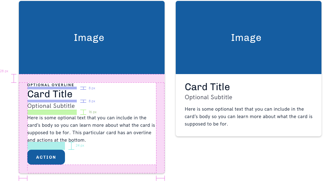
Here is some optional text that you can include in the card’s body so you can learn more about what the card is supposed to be for. This particular card has an overline and actions at the bottom.
Card without Media
Here is some optional text that you can include in the card’s body so you can learn more about what the card is supposed to be for.
Card Structure and Spacing
Cards may be any width but whenever used in a group, they should have the same width.
Basic Visual Style
Stationary
Border Radius: 8 px
Drop Shadow: box-shadow: 0 2px 5px 0 rgba(0,0,0,0.24);
Hovered
Border Radius: 8 px
Drop Shadow: box-shadow: 0 2px 16px 0 rgba(0,0,0,0.24);
Usage

